Business
The brand has two audiences at once — future tenants and future visitors — so it works as a leasing tool and a place experience.
VistaPods brings retail, community, nature and everyday life together in Southkey, Johor Bahru. We gave the destination its identity — and one flowing line that carries visitors from the hoarding to the front door to the staff lanyard.
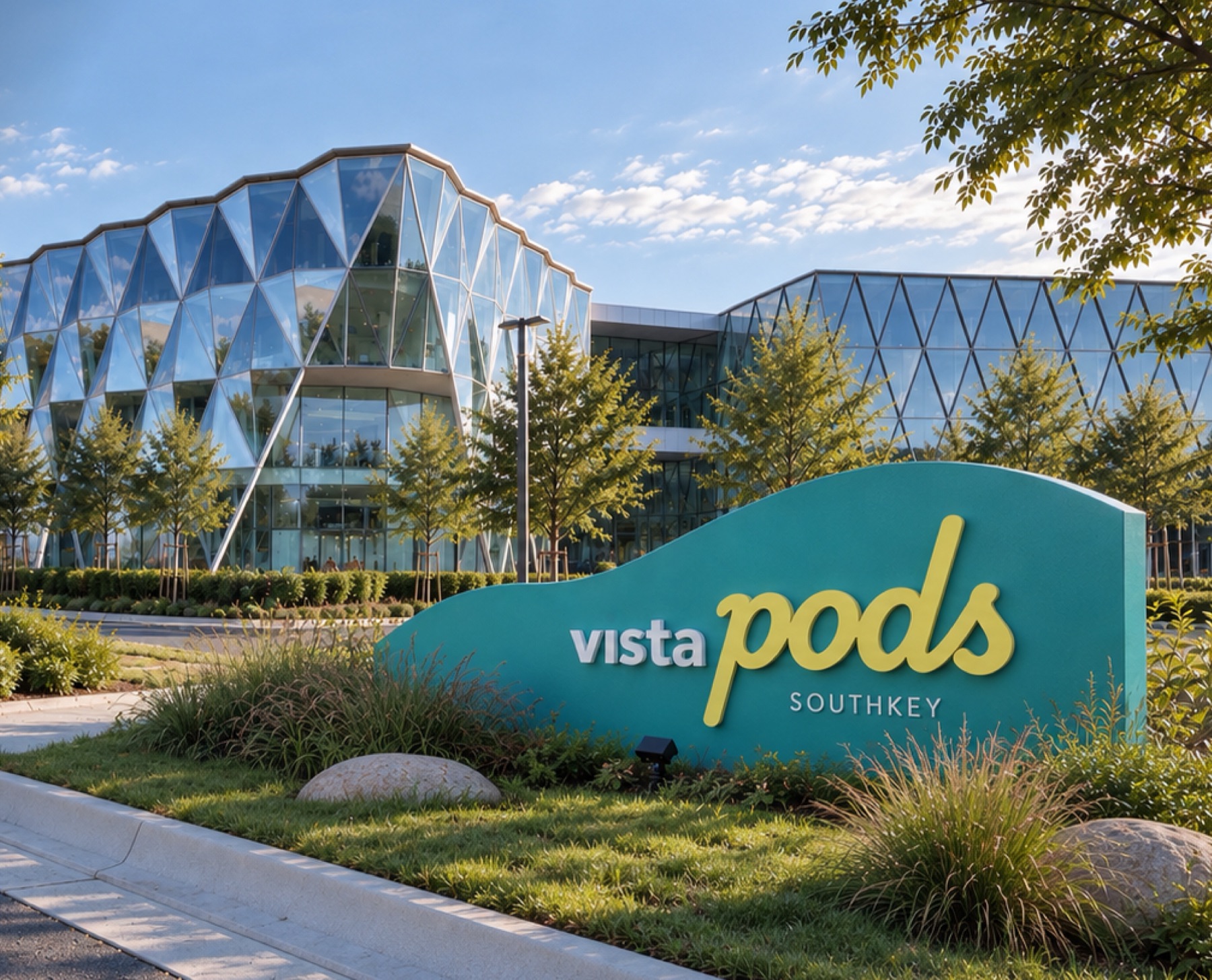
Give a place that isn't open yet an identity people want to visit, gather in and come back to.
Vista Velocity is developing VistaPods as a walkable, open-air destination where shops, cafés and community share the same space. Before the first visitor arrives, the brand has to sell the vision — on hoardings, banners and social — and win tenants at the same time.
Once the doors open, the same brand has to guide people around the site and dress the team who welcome them. It needed to feel modern and architectural, but also relaxed and human: a place for people, not just a property.
The brand has two audiences at once — future tenants and future visitors — so it works as a leasing tool and a place experience.
People remember places by how they feel there. A relaxed script and a soft, moving line say open, easy and connected.
Johor Bahru has no shortage of enclosed malls. VistaPods leads with open air and community, in a fresh palette that stands apart.
One system that scales from a lanyard to a building-sized sign without losing its character.
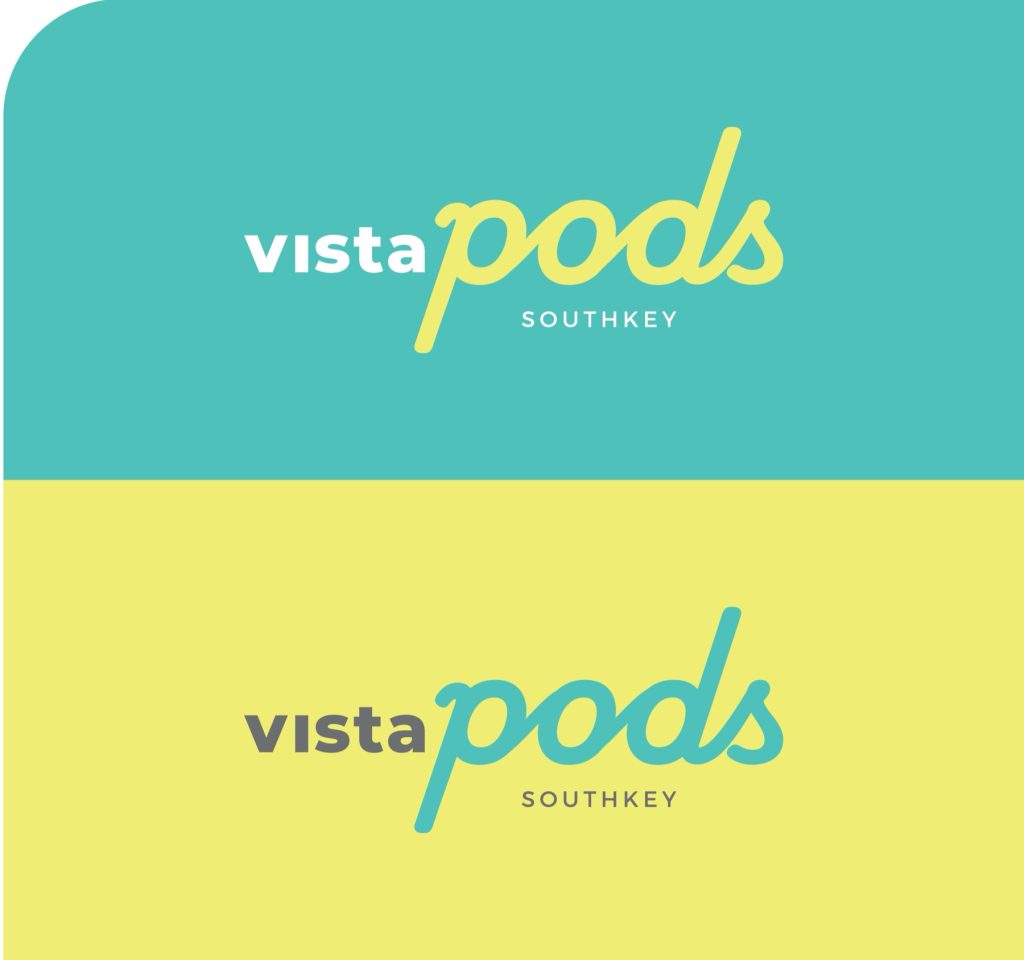
“vista” is set in a clean, structured sans-serif for architectural clarity. “pods” is a custom fluid script for movement, energy and community. Together they balance place and people — exactly what the destination promises.
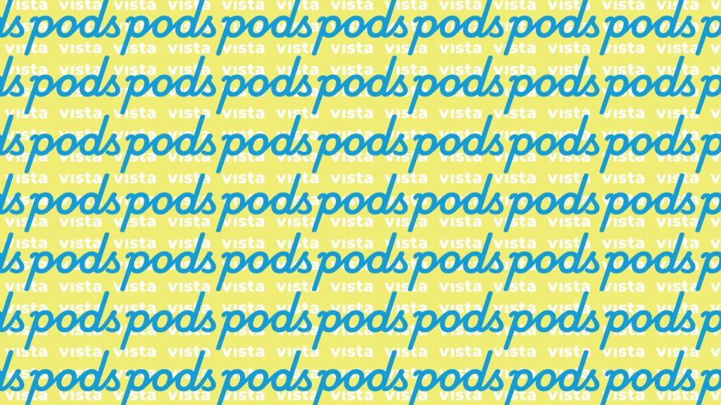
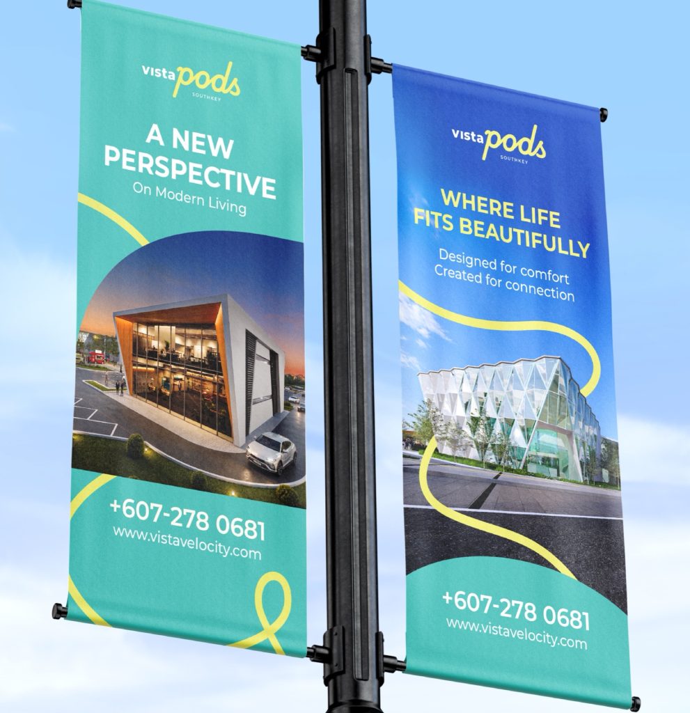
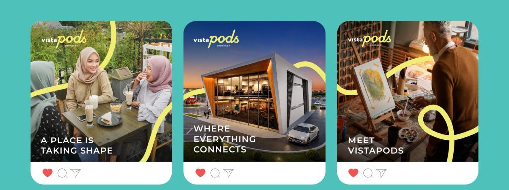
The Fluid Path is a single continuous line for movement, exploration and connection. It wraps photos, runs along hoardings, loops across uniforms and points the way on signs. A repeating “vista pods” pattern adds rhythm where the line needs a partner.
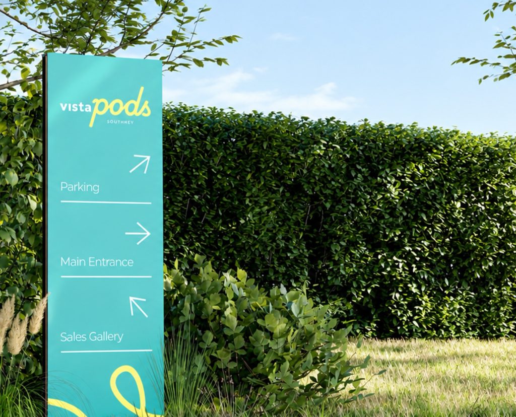
The first thing visitors see: an aqua monument sign with the script logo, set into the landscape in front of the building.
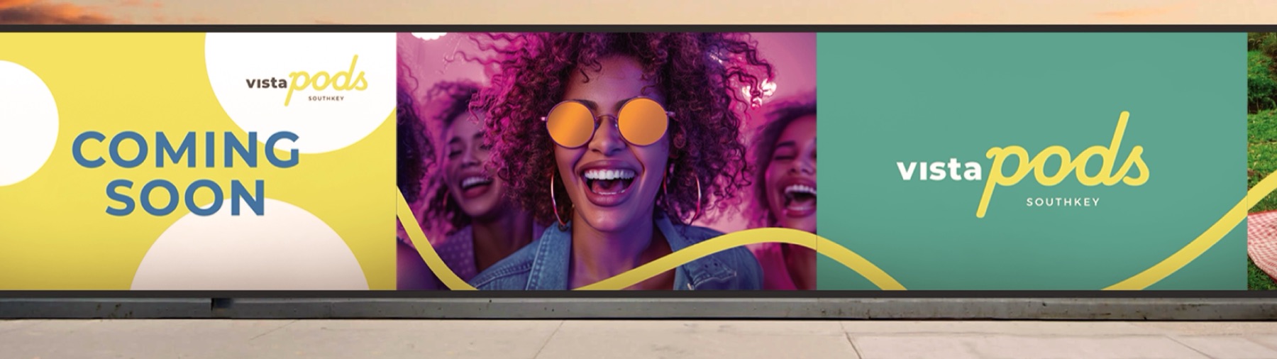
Hoardings and street bunting sell the lifestyle long before the first shop opens — people, picnics and sunshine, held together by the Fluid Path.
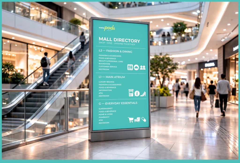
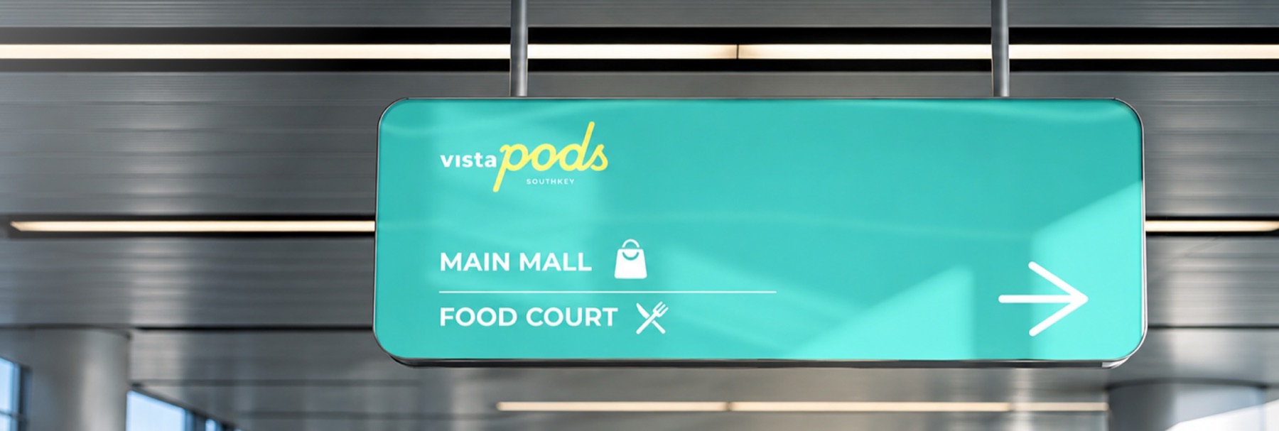
A wayfinding family that turns the identity into a guide — outdoor totems, parking signs, ceiling signs and a mall directory, all in the same aqua.
Business cards, staff lanyards and uniforms carry the same loop, so the team feels like part of the destination.
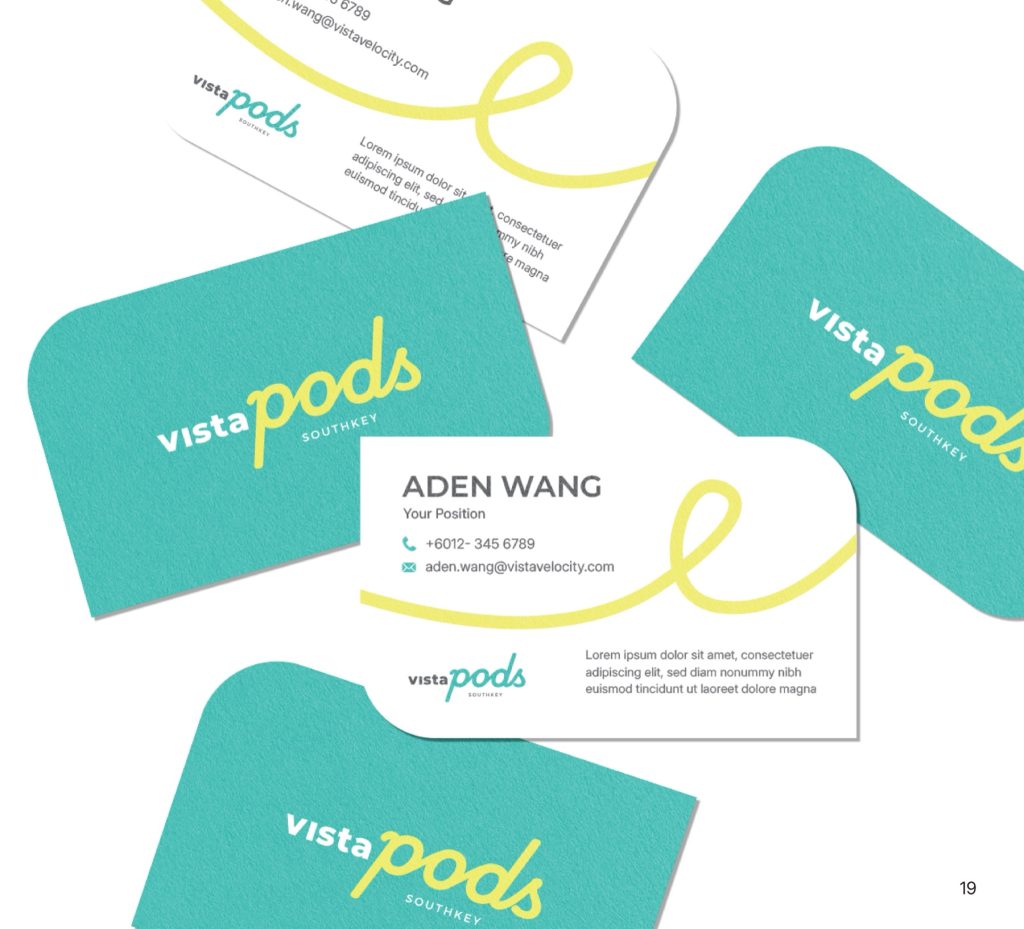
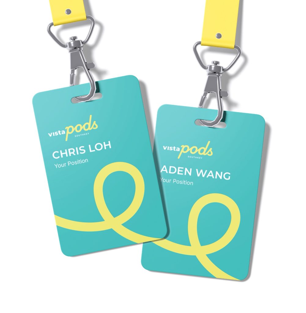
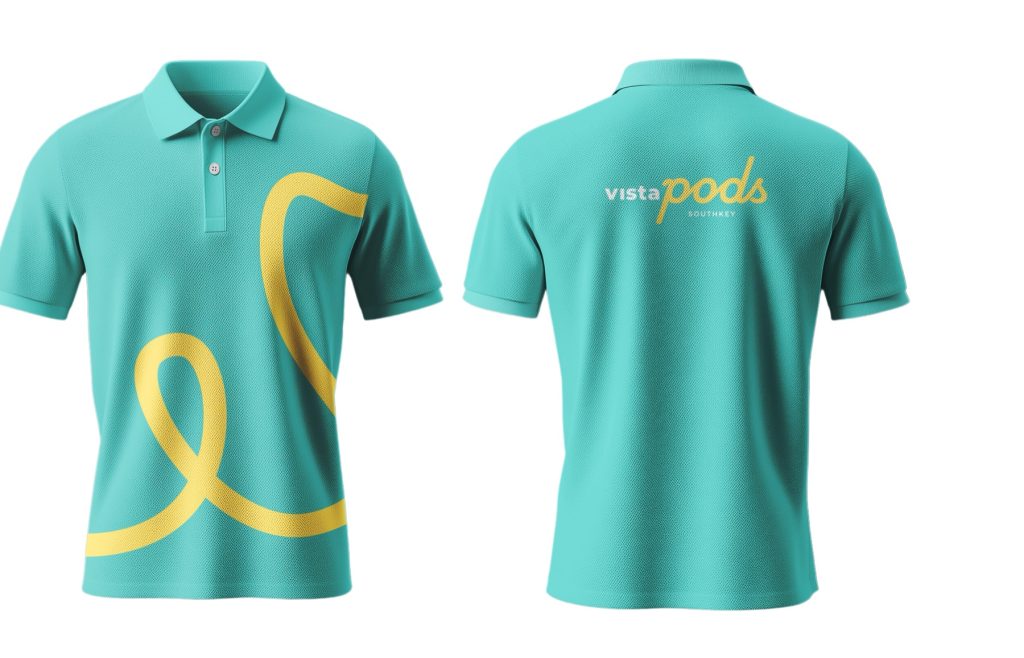
A complete place brand, documented in a 42-page guide — so every new tenant, sign and post feels like VistaPods.